Web Design and UI Trends to Follow in 2020
New year, new web design trends. Get inspired for your next project.
We are already starting to see some design elements that will be hot in 2020 (and maybe beyond). Most of these trending web design themes are continuations of things that have been building in design projects – more gradients, rule-breaking typography, and plenty of minimalism.
But there are trends that are emerging as well, such designs that feature “dark modes,” more interfaces with audio elements, and a big push for 3D images and elements.
Keeping a keen eye on design, our Studio have highlighted some of the upcoming trends emerging through 2020 and beyond. We see trends develop over time with most of what's current, being a continuation of what's come before. Think gradients, breaking the rules of typography and a whole lot of minimalism.
Areas we expect to take full force over the following months are trends such as 'Dark Modes' being pushed to the forefront by applications and computing UI, the return of audio but in a less invasive more clever approach, whilst the forever pushed 3d Images & elements.
Minimalism + White Space
A classic design trend that stays current each and every year.
The beauty of this trend in particular is that, whilst holding core principles, we see it ever evolving. In it's current state and for the foreseeable future, the focus is on big open spaces. We're seeing designers do this with great effect by going against what you'd expect to find thus creating an unexpected impact ultimately strengthening the brands confidence.
We took this ethos into consideration whilst working on the beautifully original, Fulton Garrick Website
Something we learnt through this process was that white space doesn't necasserilly have to be white, using block colour in areas to ease userflow whilst keeping to the minimilist design created a bold look whilst maintaining the premium guidelines we set.
This example shows why minimalism works: They are elegant, beautiful, and easy to understand (making them highly usable).
“Dark Mode” Design
With many apps redeveloping to cater for the Dark Mode functionality, as opted for by the user, we are now seeing this user case spread it's wings into the design domain.
This is cause and effect, the people ask for it and the designers deliver.
What makes the dark aesthetic so attractive is when combining with bright accent colours and typogrpahy easier to read through thus carrying practical keynotes.
We followed this trend whilst working on the stunning Q Shoreditch, with it's close ties to London Nightlife, it seemed fitting to go with a dark backdrop.
To compliment the design, we made a rule to avoid the use of white text (as a typical go to), this practise strengthened the mood of the site whilst adding a luxurious appeal.
Breaking Typography Rules
Adhering to this trend takes a different approach to typography. The focus being that the text is more a design element as opposed to an informative one, the key is balancing the fine line between the too whilst preventing it from becoming simply design with no use.
If the idea is to be as creative as possible, the user still needs to understand the message you wish to portray. We took this approach into consideration when designing the, bright & bold, Green Grill Website. We wanted the site to be loud and to bolster this theme we really emphasised the copy throughout the page, whilst doing so, we ensure there was a strong heriachy trhoughout to ensure the users reading flow was on point.
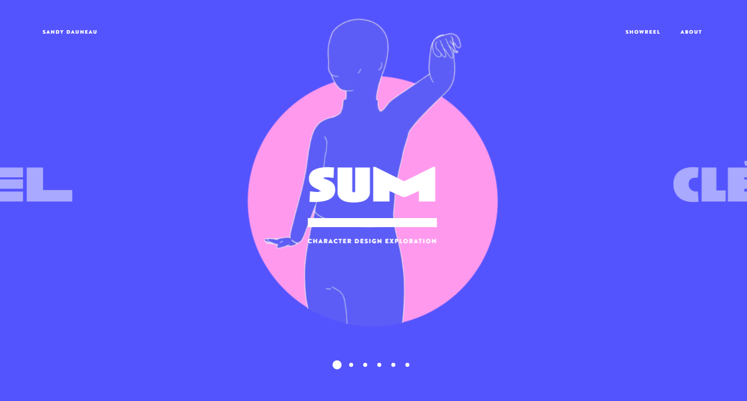
Artistic Illustrations
Ever growing in popularity, we see bespoke Illustration remain at the forefront of brand identity for certain industries and product types.
In particular, we've seen a keen focus on line-style drawing brought to life by subtle animation. This trend gives the user the feeling of authenticity, unforced and a little bit whimsical.
This ethos has been brought to life by the impressively talented designer Sandy Dauneau from across the pond. Combining illustration with animation across a well thought out colour pallet has amplified the brand identity. Check it out here: https://sandydauneau.fr/
Mixing Illustration and Realism
Another rule-breaking trend dominating 2020 combines a crafted approach with great use of photography.
This trend shines through in the fashion industry allowing the designer to highlight certain areas, retaining a cultural vibe whilst managing an authentic appeal.
With the right skillset, animation on top can take this trend to the next level and has been showcased masterfully by acclaimed designer, Selman Hoşgör: Who Picks The Oscars showcase.
.gif)
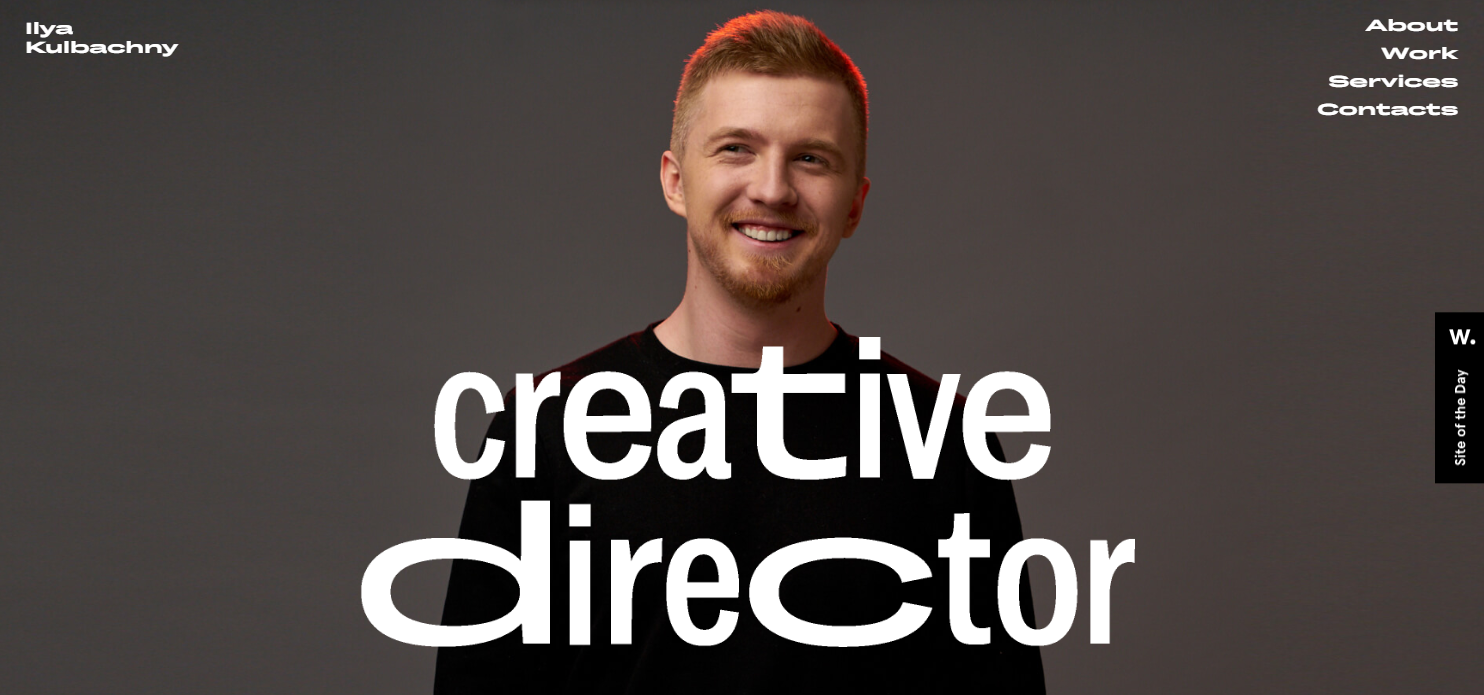
Liquid Animation
Any website built in the modern age is likely to come with some form of animation, so it comes with no surprise that designers & developers are constantly pushing the boundaries and working out creative ways in which to express their content.
Liquid animation can work for entire scenes as a way to transition video elements, as a hover state to entice clicks, or as a general animation the helps draw users into the design. The trick to making this trend work is in the speed of movement. It has to be smooth, fluid, and perfectly timed for the most realistic feel.
Ilya Kulbachny uses liquid animation for the headline of his portfolio website. (This might be one of the best uses of this design trend out there.) The words ripple across the screen with additional layers to create a truly alive feel.
3D Design
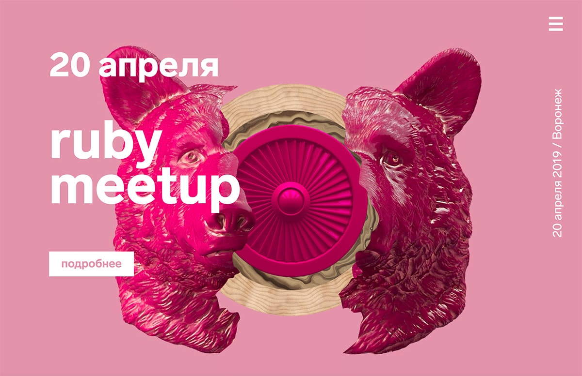
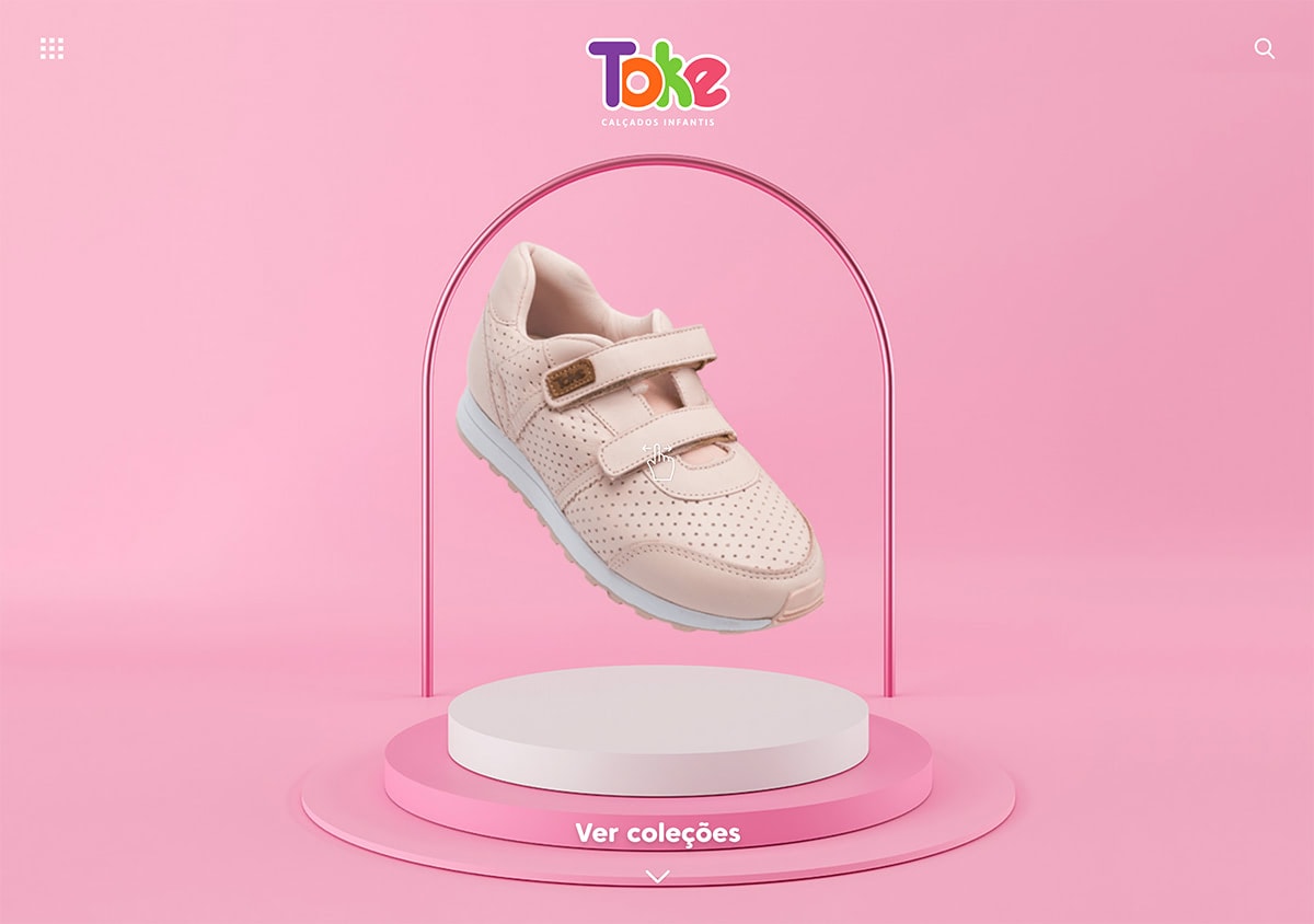
Adding depth creates a greater sense of realism for a design. Three-dimensional imagery is an extension of that idea. It’s a trend we started to see a lot of near the end of the decade, and expect to see a lot more of into 2020.
The best 3D designs give users something a little unexpected, such as the mask that breaks apart on the Metaconf Meetup site or the sideways scroll for tiny shoes on the Toke site.
Audio User Experiences
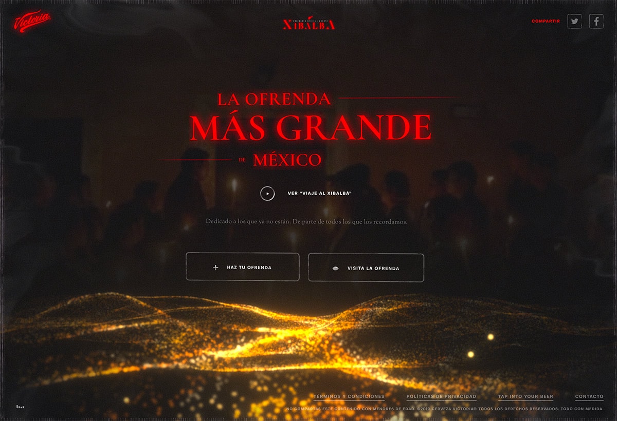
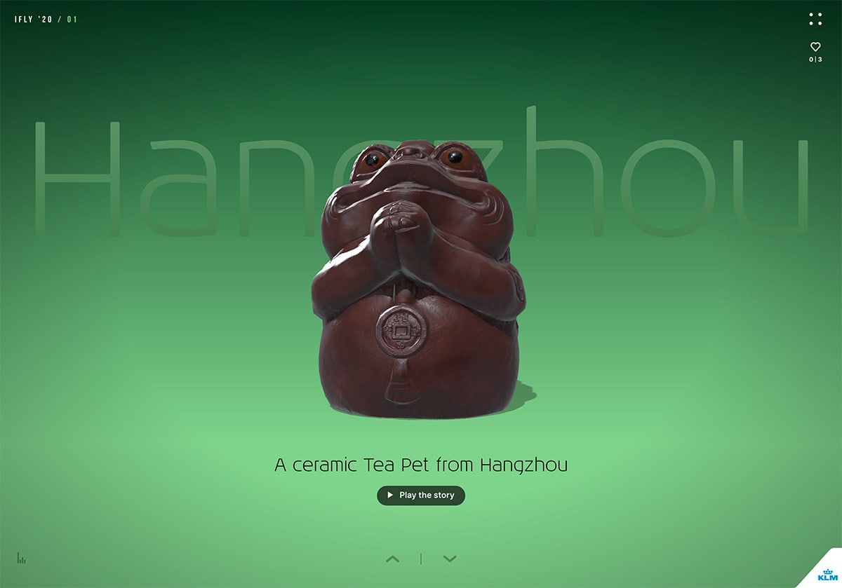
While you can expect to read a lot more about designing for voice in the coming year, one part of that trend is already here – designing with sound.
Gone are the days of .tk domains and the wild west of website development. Websites have such an importance to engage the user that each eleemnt should be carefully considered. We phased the idea of background music on our sites several years back. The practise is intrusive and this is portrayed through a high drop rate when looking at the numbers with it on or off.
With that being said, especially with the likes of Siri or Amazon's Echo, people want to make navigation even easier then having to click a button (welcome to 2020). To do this tastefully is a fine line but done correctly, can create a seamless journey through your brands story and offering.
"La Ofrenda Mas Grande de Mexico and IFly Magazine both honor that rule and use sound to enhance the quality of the user journey in their designs. The best use of audio user experience might be in designs where there is a language barrier, because music can be a great unifier when it comes to web-based storytelling."
Layers that Overlap
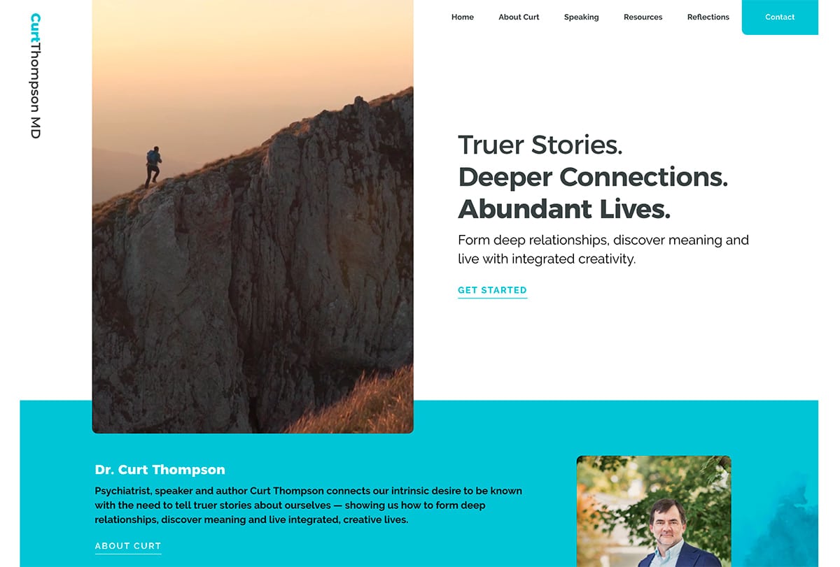
Layers, layers, and more layers. Overlapping layers and elements don’t quite create a 3D effect, but they do add a sense of depth and dimension to projects.
While overlapping layers can come in the form of a single element, this trend often includes multiple overlapping elements. The best part is that it works with almost any type of design scheme.
You can overlap boxes and backgrounds, images or video, text or user interface elements and icons. The trickiest part might be ensuring that the overlapping look flows through the scroll of the design.
We re-iterate this design practise within our Q Shoreditch website. Creating bold blocks of content whilst maintaining a luxury appeal has created a great creative tension as the websites identity.
Curt Thompson MD’s site does it with rectangular cards with rounded corners. You can almost expect any design element with rounded edges will overlap something else to create depth of field. It’s a nice way to organize a lot of different element and content types in a unified manner.
Color-Changing Gradients
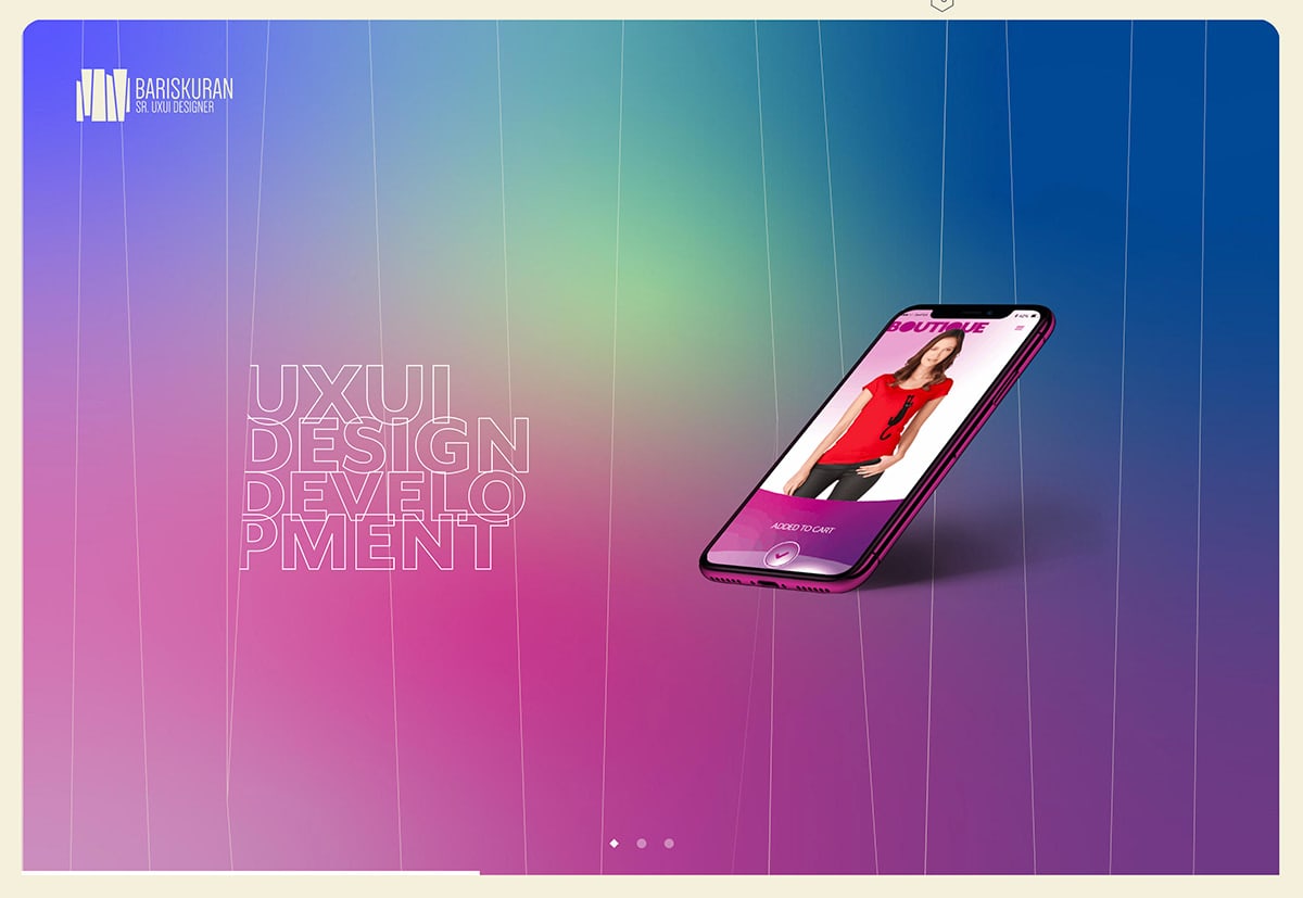
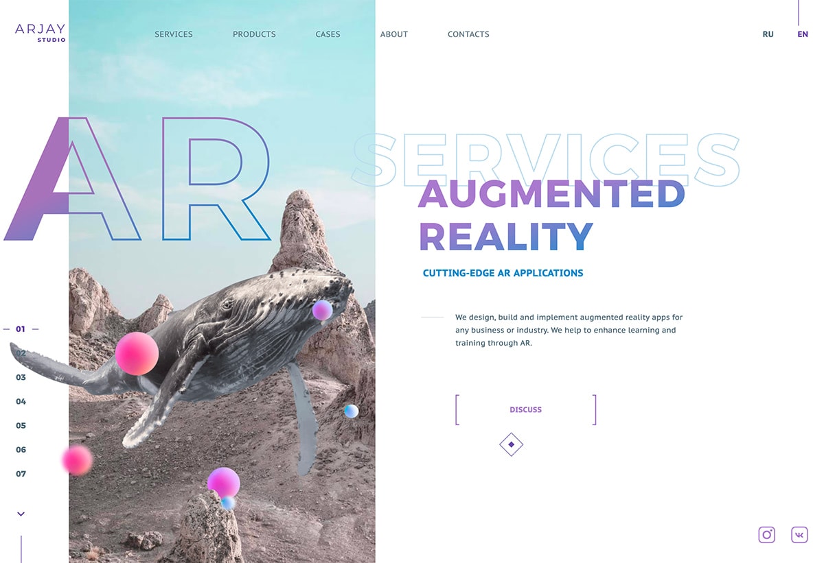
There was a brief period during the height of flat design that designers shied away from gradients. But they came roaring back and will be even bigger in 2020.
From bold backgrounds with multi-color gradients to subtle gradients for texture, this trend is everywhere. What we are seeing now, is gradients that combines multiple colors with quite a bit of contrast, rather than more subtle-monotone gradients that were popular as of late.
Bariskuran uses bold gradient for a portfolio design that has a lot of impact; Arjay Studio uses gradient for text elements as well as “bubbles” in the AR visual. (Using multiple gradients is a popular theme as well.)
Streamlined Navigation
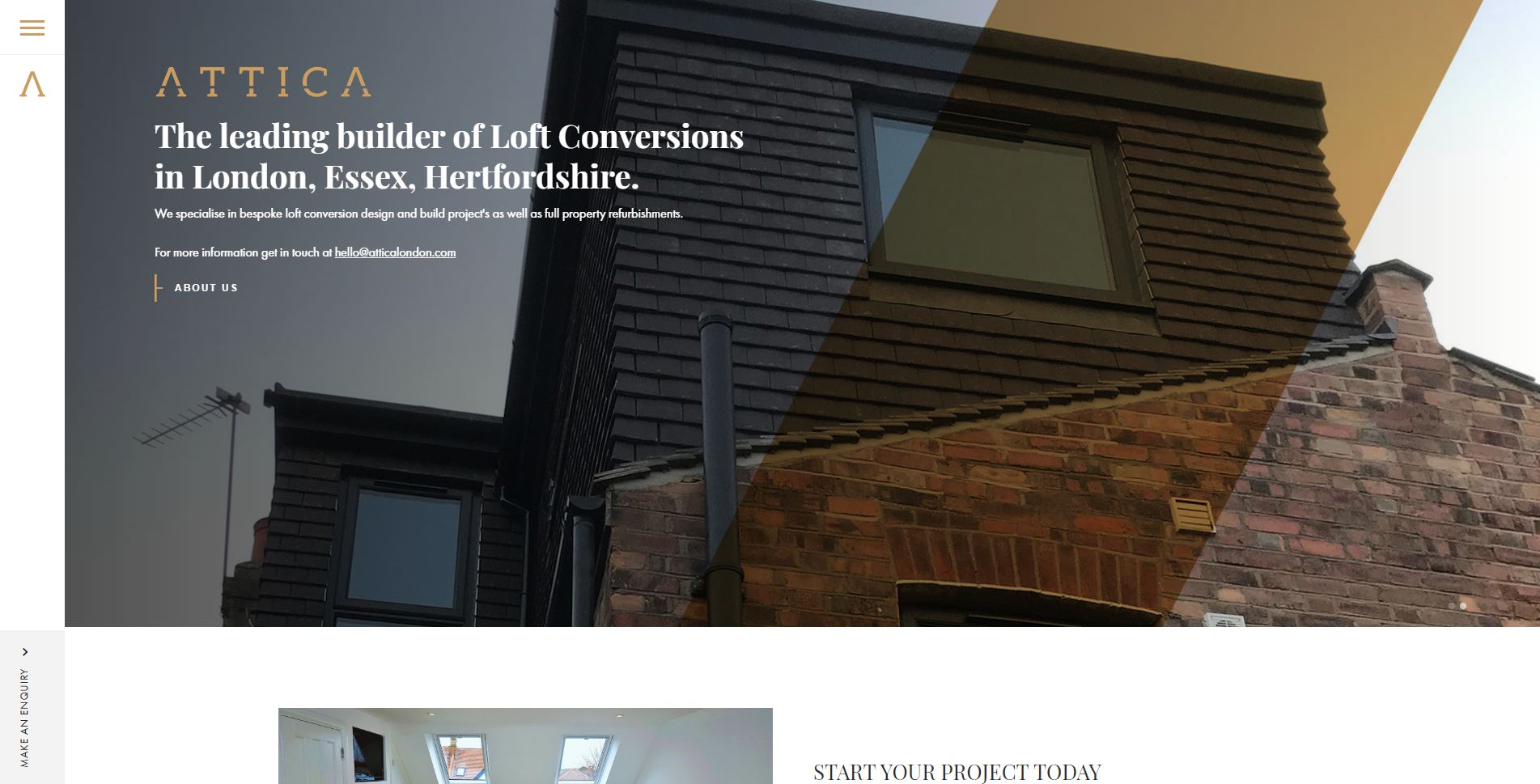
Most users get to your website via search engine and might not start on the homepage. Less navigation creates a more direct path to where you want users to engage most with the design. Streamlined navigation styles provide more room on the main canvas area for messaging and content.
We do this to form of streamlined navigation, with menu items inside an icon. The icon opens nav into a full-screen list of options.
Attica London also tucks navigation into a small, corner hamburger icon. It pops out on desktops and mobile in the same manner, creating a consistent experience.
Conclusion
As our digital landscape continues to develop, we remain inspired by the limitless creativity we see in designers across the world. We love seeing the trends above emerging through website design sometimes incorporating more than one example to great effect.
Modern design elements work well together, exploring these ideas through combinations allow for us to express how we feel and ultimately develop as creatives. As design schemes become ever more complex, we constantly see rule books going out the window as we adapt our approach to suit the futures needs.
As far as we see it, we will continue to design based on usability and reason, we'd love to see your creations and always happy to help you with your next big project. Keep an eye on our Projects page for new features as we showcase our upcoming work!
For more information, get in touch at hello@disruptivesocial.co.uk